Chimpzlab’s RPA solution slashes website audit time by 80%. Discover how! Download Report
Branding for FAR EAST ASIA
Project Highlight
Designing | Branding
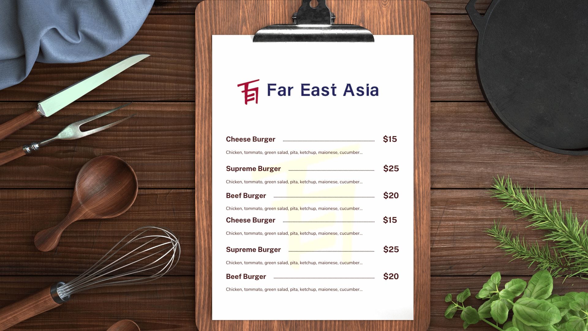
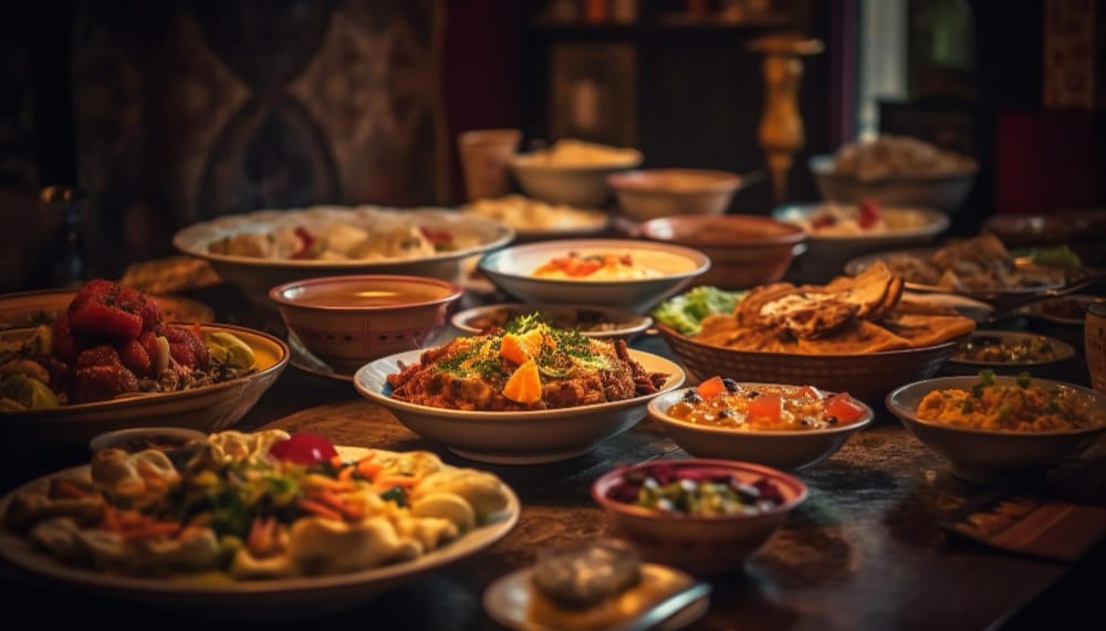
Far East Asia is a culinary haven that beckons patrons to embark on a gastronomic adventure through the diverse and vibrant flavors of Pan-Asian cuisine. Their menu showcases the rich culinary tapestry of the region, offering an affordable yet delightful dining experience.
Challenge
Far East Asia required a logo that vividly captured the essence of Pan-Asian culinary traditions. The goal was to reflect the diverse flavors, culture, and vibrancy of Far East Asia’s offerings while resonating with their patrons.
Objective
Convey the cultural richness and diversity of Pan-Asian cuisine in the logo.
Create a visual identity that captivates the essence of Far East Asia’s culinary journey.
Utilize symbolism to craft a unique character-like logo using the initials F, E and A.
Solution
In response to the challenge and objectives, we conceptualized and designed the logo for Far East Asia. The logo encapsulates the essence of the Far East Asian culinary journey and the vibrant diversity of flavors within this cuisine.
Design Elements:
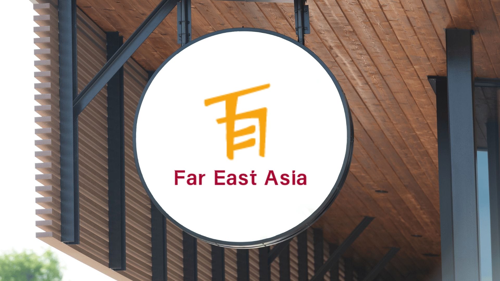
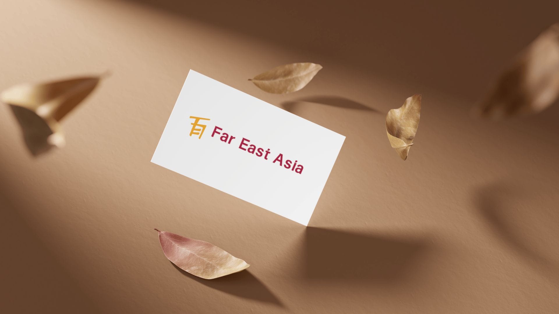
Character-like Initials: The initials F, E, A are artistically crafted to resemble a unique Asian script character.
This symbolic representation embodies the cultural depth and identity of Pan-Asian culinary traditions.
Color Palette: A dynamic color palette consisting of red and yellow was chosen to evoke energy, passion, and the lively essence of Far East Asian culture and cuisine.
Typography: “Vertrio” typeface was carefully selected for its sleek and modern appearance, aligning with the brand’s vision of providing an affordable yet contemporary culinary experience.
Impact
The “F, E, A” logo serves as a visual gateway to the diverse flavors, cultures, and vibrancy of Pan-Asian cuisine offered by Far East Asia. It resonates with the target audience, drawing them into a delightful culinary journey.
The logo has been well-received by the target audience and has become a recognizable symbol associated with affordable, authentic Pan-Asian culinary experiences.
It has successfully positioned Far East Asia as a go-to destination for those seeking a culinary adventure through the flavors of the Far East.